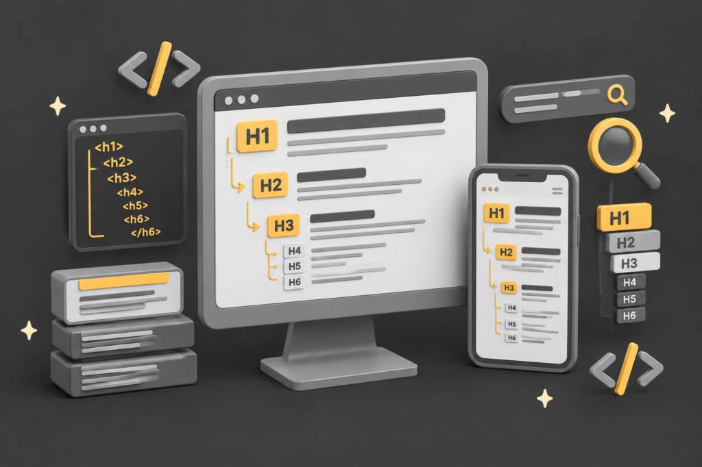
TL;DR: Heading tags are semantic labels, not styling controls. Their real job is to tell search engines and screen readers what your content is and how it is organised, which is a separate task from deciding how big or bold the text looks.
The most common mistake we see at QED on quite a regular basis, often choosing a heading tag for the font size it happens to render at, rather than for the meaning it carries. That is a markup problem, and no amount of CSS fixes it, because CSS never changes what a tag means.
This guide explains what heading tags actually do, why the tag and its appearance are two different jobs, how to get the visual result you want without breaking the structure, and where WordPress quietly leads people astray.
Heading tags are one of the clearest signals a search engine uses to work out what a page is about, and they are misused on a huge number of websites. At QED we see the same pattern constantly: someone picks an H4 because it looks the right size, or reserves the H1 for a system-generated title and never uses it in the content at all. The tag ends up describing the wrong thing, or nothing.
If you run a small business website in the UK and you have ever wondered whether your headings are helping or quietly hurting you, this is the piece that sorts it out. We will keep it practical and we will not overstate the SEO side, because the honest version is more useful than the hyped one.
What is the difference between a heading tag and its styling?
The heading tag decides what a piece of text means; CSS decides what it looks like. These are two separate jobs, and the mistake most sites make is letting the second one dictate the first.
The HTML tag answers the question “what is this?” An <h2> says “this is a second-level section heading”. That is semantics, and it is the part search engines and screen readers read. CSS, which stands for Cascading Style Sheets and is the language that controls appearance, answers a completely different question: “what should this look like?” Font size, colour, weight, spacing. Search engines and screen readers largely ignore this layer.
Here is the crucial consequence: styling never changes what a tag means. You can make an <h2> render tiny and grey, or make an <h4> render huge and bold, and to a search engine the first is still a major section heading and the second is still a minor one. Appearance and meaning are decoupled. The official HTML documentation is blunt about this: MDN Web Docs (Mozilla, 2025) instructs developers not to use heading elements to resize text, and to use the CSS font-size property instead. So the correct way round is always to pick the tag for what the content is, then style it to look however the design needs.
There is also a real difference in how you apply that styling, and it matters more than most people realise for site performance, which we cover in the WordPress section below.
What are the most common heading tag mistakes?
The three mistakes we see most often are all variations of letting appearance override meaning: no H1 at all, the H1 wasted on a template title, and tags chosen by size. Each one weakens the page’s structure for both search engines and assistive technology.
The first is pages with no H1 whatsoever. Some templates and page builders do not expose the H1 to the person editing the content, so section headings get marked up as H2 or H4 while the top-level label is missing entirely. The book has chapters but no title.
The second is the H1 reserved for a fixed, system-set title that has nothing to do with the page’s real subject, while the actual content uses H4s as section dividers because they render at a comfortable size. This is exactly the situation that prompted this article: a real exchange on LinkedIn where a website provider explained that their standard process was to avoid H1 and H2 in the body because they “look too big”, using H4 for sections and reserving H1 for a preset title. That is styling logic driving structural decisions, and it is common across templated and franchise platforms.
The third is skipping levels for visual effect, jumping from an H2 straight to an H4 because the H3 in that theme looks wrong. This breaks the nesting that screen readers rely on to build their navigable outline.

Whether any of this moves your rankings is a fair question, and the honest answer has more nuance than most articles admit.
Do heading tags affect SEO rankings?
Headings help search engines understand your page, but they are a minor direct ranking factor, and getting the count “perfect” will not lift a page on its own. Their value is mostly in structure, clarity, and accessibility, which support rankings indirectly.
This is the part where hype usually takes over, so let us be precise. As reported by Search Engine Journal (2019), Google’s John Mueller, a Search Advocate at Google, said:
“You can use H1 tags as often as you want on a page. There’s no limit, neither upper or lower bound.”
And,
“Your site is going to rank perfectly fine with no H1 tags or with five H1 tags.”
Treat that as the vendor’s own statement about its own system, reported by the trade press, rather than independent proof, but it has been consistent and long-standing.
So the widespread belief that headings are a heavy ranking lever is a misconception.
What headings genuinely do is help a search engine parse the page and match sections to specific queries, and help the roughly 71.6% of screen reader users who navigate by heading (WebAIM, 2024).
Both of those improve the odds of ranking and of keeping visitors, but neither is the crude “add keyword to H1, climb the results” mechanism that circulated in the early 2000s. That said
The single H1 is still the safest practical default even though multiple H1s are technically allowed, because one clear top-level label is unambiguous for every reader, human or machine. Now to the tool most QED clients actually use, and where it helps and traps you.
How do you use heading tags correctly in WordPress?
In WordPress, set the heading level for meaning and control the size separately in the styling controls, never by choosing a different heading level to get a different size. Most WordPress editors and page builders keep these two controls in separate places, which is exactly what causes the confusion.
In the block editor, a Heading block has a level selector (H1 to H6) that sets the tag, and typography settings that set the size. In page builders, a heading widget works the same way: one dropdown for the HTML tag, a separate panel for font size and appearance. The two controls sitting apart is the whole trap. It is easy to pick the tag by eye to match a size you like, rather than setting the tag by meaning and adjusting size in the style panel. Set the tag first, from the content’s role on the page. Then, if it looks wrong, change the size, not the tag.
The styling question then becomes: how should the size actually be applied? There are two ways, and one is much lighter than the other. The first is a stylesheet rule, either a site-wide one such as making every H2 a particular size, or a targeted CSS class applied to specific headings. The second is an inline style written directly onto the individual element. They produce identical meaning to a search engine, so neither is “better for SEO”, but they are very different for page weight.
The inspiration fo this post was born out of a posting on LinkedIn. One suggestion was to add CSS to make heading structure “bomb proof”. The honest position is that CSS does no SEO work at all, because search engines read the tag, not the styling.
What correct CSS does is let you use the right tag without compromising the design, so you never have to reach for the wrong tag to get the right size. That is the real value, and it is a design-and-performance benefit, not an SEO one. We apply exactly this thinking on our own site, weareqed.com, where a bespoke outlined heading effect in the hero is one deliberate, one-off styled element rather than the default way every heading is sized.
What the code would look like for custom heading tags
In CSS for your site you could add this
h1 { font-size: 3.5em; }It would resize every <H1> on your site to 3.5em, irrelevant of where it is.
To have a more targeted approach you’d use a class selector, in CSS:
.hero-title { font-size: 3.5em; }Then in HTML use:
<h1 class="hero-title">QED</h1> <!-- this one gets it -->
<h1>Some other page heading</h1> <!-- this one doesn't -->
This means every time you use the class selector of hero-title the CSS would style the font to 3.5em size. For a very targeted approach you could also just use HTML:
<h1>style="font-size: 3.5em;>QED web design</h1>
What is the correct heading hierarchy?
The correct hierarchy is one clear H1 describing the whole page, then H2s for main sections, H3s nested under the H2 they belong to, and so on without skipping levels for appearance. The rule is about nesting and meaning, not about hitting a specific number of each.

In practice this means a page starts with a single H1 that states what the page is about, ideally reflecting the main topic and appearing as the first heading. Under it, each major section gets an H2. Where a section has subsections, those become H3s. You only reach for an H4 when you genuinely have a subsection within a subsection, which most pages never need. The key discipline is not to jump from an H2 to an H4 because of how a level looks, because that skip is exactly what breaks the outline for screen reader users.